School Project
School Project
Balance Wellness App
Balance Wellness App
Balance Wellness App
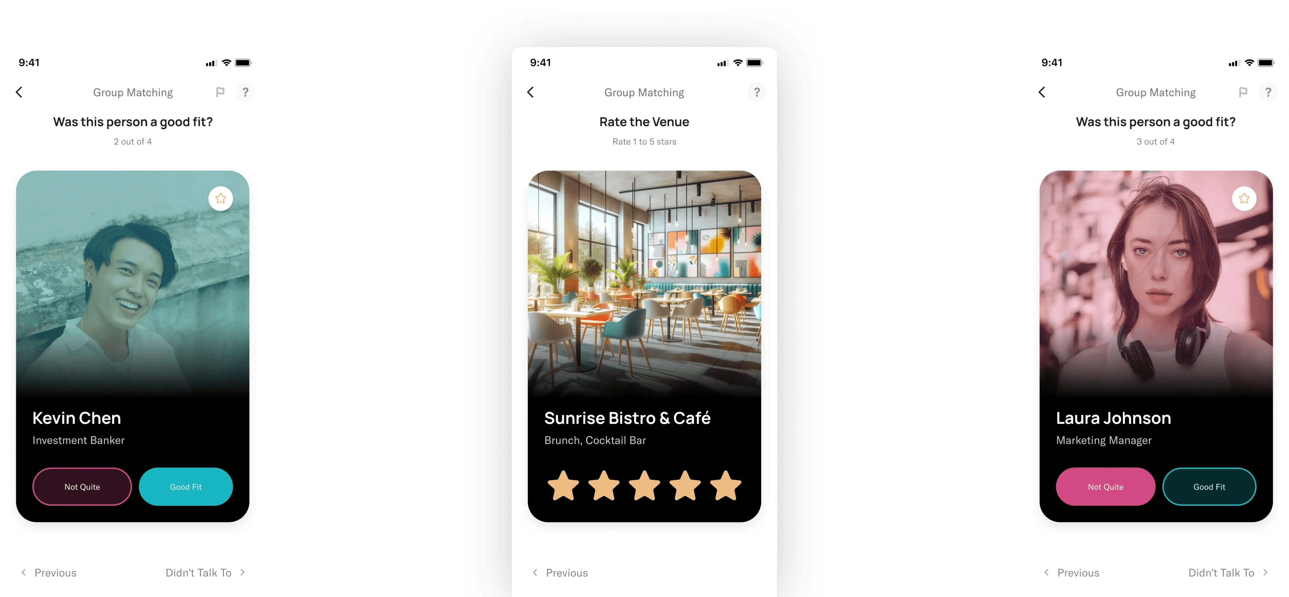
A fun and easy way for users to train the Better Off Social algorithm and improve their future experiences.
A fun and easy way for users to train the Better Off Social algorithm and improve their future experiences.
OVERVIEW
An app to help people be productive post-pandemic.
The theme for this project was “Back to Normal”. What’s a product we can design to help people as they transition out the isolated pandemic lifestyle?
Lead UX Designer
Lead UX Designer
My Role
Mobile App
Mobile/Desktop Web
Platform
8 Weeks
8 Weeks
Timeline
PROBLEM
Less than 30% of users complete the post-event feedback form
A mobile app that users can easily access on the go.
It will help users track their daily workload, stay motivated, find productive environments, and reduce both personal distractions during work time and work-related distractions during personal time.
Surveys are boring
People didn't want to spend time filling out a lengthy form, regardless of the benefits.
SOLUTION
A mobile app that users can easily access on the go
A mobile app that users can easily access on the go.
It will help users track their daily workload, stay motivated, find productive environments, and reduce both personal distractions during work time and work-related distractions during personal time.
To fix the low completion rate, we used these 4 goals to craft an effective solution:
Track daily workload
Users should be able to track their daily tasks and workload.
Stay motivated
There should be features to help users find extra motivation to be productive.
Find productive environments
Users should be able to find productive work environments outside of their home.
Reduce distractions
This app should help users avoid personal distractions while working, and work distractions while at home.
RESEARCH P1: CONDUCT INTERVIEWS
Uncovering details about our users' daily stuggles
Interview Subjects
People with remote setups who were balancing work, school, and other burdens.
Key Takeaways
People were struggling with productivity, felt a large overlap between work and personal lives, and experienced feelings of loneliness when working from home.
RESEARCH P2: COMPETITOR ANALYSIS
Evaluating apps with similar funcionality
As a team, we analyzed 4 competing products to see how well they addressed our problem. My contribution was an analysis of the app "Streaks, the habit forming to-do list".
Streaks' strengths
• Goal optimization for common objectives
• Device compatibility across MacBooks, Apple Watches, and iPads
• User-to-user connections for motivation
Areas for improvement
Pricing strategy: Consider offering a free trial before paid access
Goal achievement guidance: Introduce tips and feedback for users
Inclusivity Assessment
Challenges:
Pricing barrier: $4.99 cost may limit user adoption
Limited goal-setting options: Users can't set custom goals
Recommendations:
Enhance inclusivity by allowing custom goals to accommodate a broader user base
PERSONAS
Synthesizing insights into personas: A pathway to understanding user needs
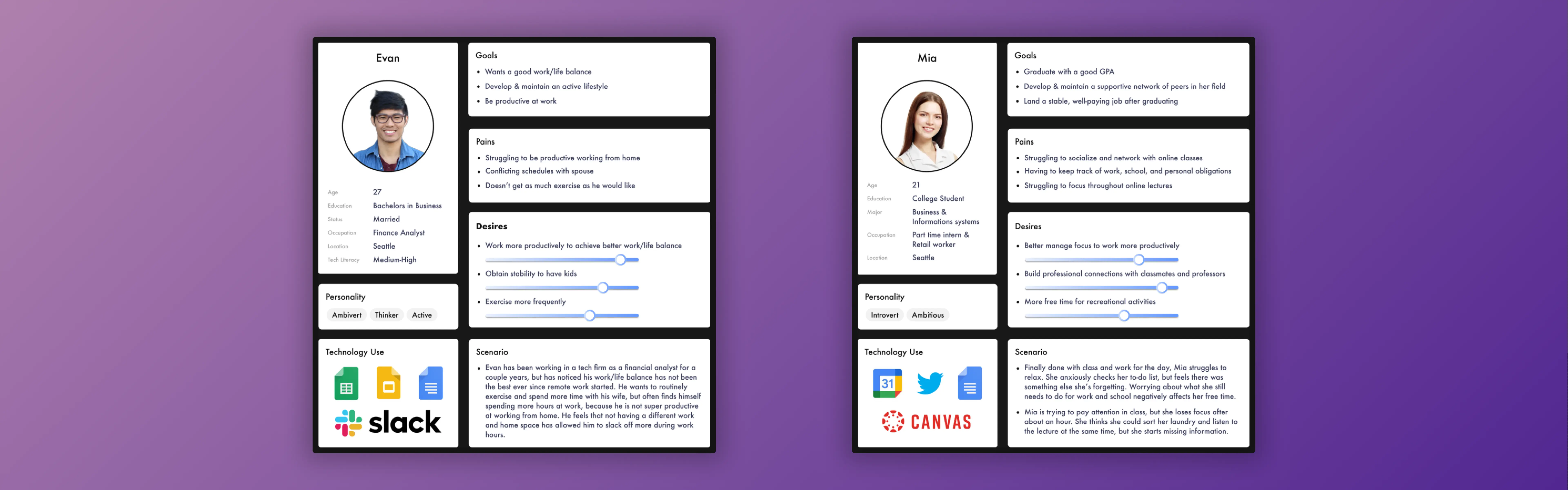
Through the process of creating personas, we were able to gain a comprehensive understanding of our intended audience by synthesizing research results and identifying their defining characteristics, objectives, pain points, and desires. By leveraging these personas, we crafted a user journey map that illuminated the various phases of our users' experience as they relate to the issue we aim to address.
Content type cheat sheet – used for sharing research findings with stakeholders
PERSONAS
Synthesizing insights into personas: A pathway to understanding user needs
Through the process of creating personas, we were able to gain a comprehensive understanding of our intended audience by synthesizing research results and identifying their defining characteristics, objectives, pain points, and desires. By leveraging these personas, we crafted a user journey map that illuminated the various phases of our users' experience as they relate to the issue we aim to address.
Content type cheat sheet – used for sharing research findings with stakeholders
USER JOURNEY MAPS
Leveraging journey maps to uncover insights on user stages and emotions
By creating personas, we gained a deeper understanding of our target users by consolidating research findings and identifying key characteristics, objectives, pain points, and desires. These personas served as the foundation for our user journey map, allowing us to grasp the various stages our users encounter as they address the issue we aim to solve. Through this process, we acquired invaluable insights that enabled us to tailor our approach to better meet our users' needs.
Content type cheat sheet – used for sharing research findings with stakeholders
DESIGN REQUIREMENTS
Increase the fidelity using Expedia's design system and share with stakeholders to receive important feedback for implementation.
The design solution requirements encompassed all the aspects we sought to incorporate, informed by the user research, personas, and journey map we conducted. These requirements functioned as a guide for our early prototypes, serving as a comprehensive checklist of what we aimed to achieve.
Here are the 7 core design requirements:
Recommend activities based on location
Help users track their responsibilities
Promote collaboration with friends
Tracks users' habits on a daily basis
Allow users to restrict distracting apps
Keep user' data private and secure
Easy-to-use interface for people of all ages and lifestyles
PHASE FOUR: HIGH-FIDELITY PROTOTYPES
Creating a cohesive app design by visualizing page relationships
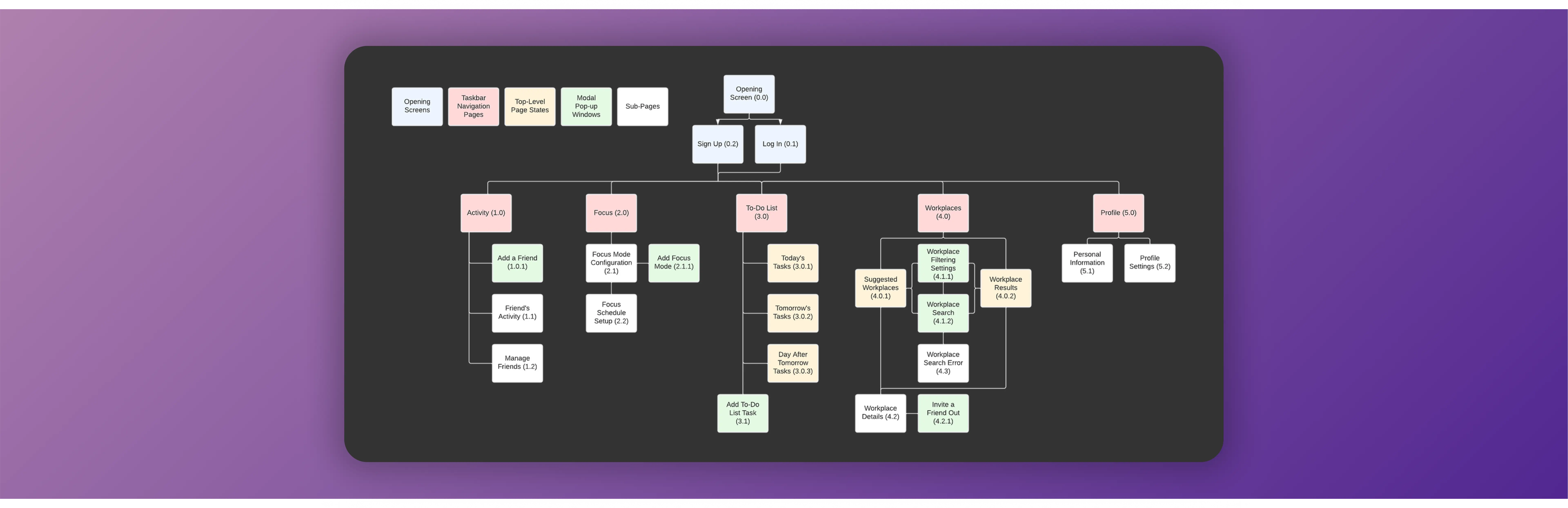
I refined my designs using Better Off's design system and ensured they aligned with the rest of the app. These prototypes went through multiple iterations, eventually culminating with a design that was intuitive, simple, and coherent with the overall product.
Content type cheat sheet – used for sharing research findings with stakeholders
PHASE FOUR: HIGH-FIDELITY PROTOTYPES
Creating a cohesive app design by visualizing page relationships
I refined my designs using Better Off's design system and ensured they aligned with the rest of the app. These prototypes went through multiple iterations, eventually culminating with a design that was intuitive, simple, and coherent with the overall product.
Content type cheat sheet – used for sharing research findings with stakeholders
PHASE FOUR: HIGH-FIDELITY PROTOTYPES
Refine the design and receive feedback critical for implementation
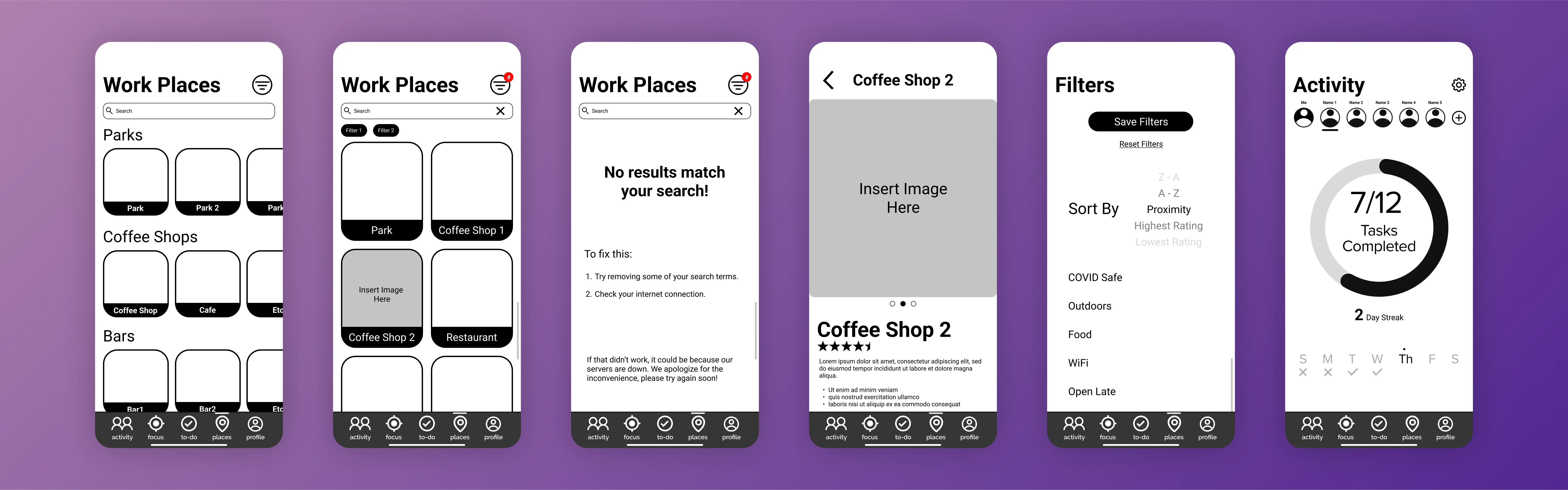
I refined my designs using Better Off's design system and ensured they aligned with the rest of the app. These prototypes went through multiple iterations, eventually culminating with a design that was intuitive, simple, and coherent with the overall product.
Content type cheat sheet – used for sharing research findings with stakeholders
PHASE FOUR: HIGH-FIDELITY PROTOTYPES
Refine the design and receive feedback critical for implementation
I refined my designs using Better Off's design system and ensured they aligned with the rest of the app. These prototypes went through multiple iterations, eventually culminating with a design that was intuitive, simple, and coherent with the overall product.
Content type cheat sheet – used for sharing research findings with stakeholders
PHASE THREE: WIREFRAMES
Evaluating the feasibility for our needs
I proposed this idea to the CEO, using wireframes and a low-fidelity prototype to convey my idea. After discussing the needs of the algorithm and purpose of the survey we agreed that this would be a viable solution.
The next step was sharing these with the developers to see if this was feasible in our given timeframe. After walking them through the interactions, and explaining the data collection, they approved the concept.
Low-fidelity prototype, and wireframes – used to receive feedback on feasibility.
CONTENT STRATEGY
Using strategic copywriting to guide our users
We also discussed the importance of content strategy and design. There were 4 areas where we felt users may have some confusion, so we used strategic copywriting to try and avoid those:
When to skip users?
People may just skip users they didn't have a good fit with, however, we wanted to discourage this since that doesn't help the algorithm. We changed the word "skip" to "Didn't talk to" to make it more clear when someone should press that button, and discourage spamming it.
The purpose of the survey
Helping users learn why they are doing this is important to getting accurate results. To ensure this we included a splash screen at the beginning where we explain why we're doing this.
This is NOT a dating app
We knew that this design might feel like a dating app, so to prevent this we shifted the focus from the person to the social interaction. We used the terms "Good Fit", "Amazing Fit", and "Not Quite" to do this.
Flagging users is serious
To make sure that people knew flagging a user was serious we added 2 confirmation stages and required a description of their actions. This will prevent accidental or improper flagging.
NEXT STEPS
Implement and test this design
This feature is currently in the development stage, once implemented we will be able to test it with real users and see if it leads to an increased survey completion rate.
NEXT STEPS
Implement and test this design
This feature is currently in the development stage, once implemented we will be able to test it with real users and see if it leads to an increased survey completion rate.
NEXT STEPS
Implement and test this design
This feature is currently in the development stage, once implemented we will be able to test it with real users and see if it leads to an increased survey completion rate.
NEXT STEPS
Implement and test this design
This feature is currently in the development stage, once implemented we will be able to test it with real users and see if it leads to an increased survey completion rate.