BETTER OFF SOCIAL INTERNSHIP
BETTER OFF SOCIAL INTERNSHIP
Social group matching
A fun and easy way for users to train the Better Off Social algorithm and improve their future experiences.
A fun and easy way for users to train the Better Off Social algorithm and improve their future experiences.
OVERVIEW
My Role
Lead UX Designer –
Interaction Design, User Flows,
Rapid Prototyping
Platform
Mobile App
Timeline & Status
8 Weeks
Currently in implementation phase
Summary
Better Off Social organizes large group social events, using an algorithm to match up people who have similar interests.
After users attend an event, they are asked which people they felt like were a good fit. This data trains the algorithm and improves their groups in future events.
Through user research we found that people don’t want to fill out a post-event questionnaire regarding their feedback so we had to think of a way to gather data that was easy, intuitive, and detailed.
PROBLEM
Only 29% of users complete the post-event feedback form
After 2 months of using the form to gather user feedback, data revealed that only 29% of users completed it. This uncovered problems related to the survey's platform, design, and wording; but one core issue stood out:
Surveys are boring
People don't want to spend time filling out a lengthy form, regardless of the benefits
PROBLEM
Only 29% of users complete the post-event feedback form
After 2 months of using the form to gather user feedback, data revealed that only 29% of users completed it. This uncovered problems related to the survey's platform, design, and wording; but one core issue stood out:
Surveys are boring
People don't want to spend time filling out a lengthy form, regardless of the benefits
PROBLEM
Only 29% of users complete the post-event feedback form
After 2 months of using the form to gather user feedback, data revealed that only 29% of users completed it. This uncovered problems related to the survey's platform, design, and wording; but one core issue stood out:
Surveys are boring
People don't want to spend time filling out a lengthy form, regardless of the benefits
PROBLEM
Only 29% of users complete the post-event feedback form
After 2 months of using the form to gather user feedback, data revealed that only 29% of users completed it. This uncovered problems related to the survey's platform, design, and wording; but one core issue stood out:
Surveys are boring
People don't want to spend time filling out a lengthy form, regardless of the benefits
SOLUTION
A fun, quick, and easy way for users to provide feedback
It is important to have users complete the feedback form because that's how the Better Off matching algorithm is trained, which will improve user's experience at future events.
To fix the low completion rate, we used these 4 goals to craft an effective solution:
Fun to do
This shouldn't feel like a survey, it should be fun and engaging
Easy to learn
The directions should be clear and users should know why they're doing this
Quick to complete
Users should be able to provide the necessary feedback in a couple of minutes
Housed natively
Users should be able to complete the form within the app – no third party redirects.
SOLUTION
A fun, quick, and easy way for users to provide feedback
It is important to have users complete the feedback form because that's how the Better Off matching algorithm is trained, which will improve user's experience at future events.
To fix the low completion rate, we used these 4 goals to craft an effective solution:
Fun to do
This shouldn't feel like a survey, it should be fun and engaging
Easy to learn
The directions should be clear and users should know why they're doing this
Quick to complete
Users should be able to provide the necessary feedback in a couple of minutes
Housed natively
Users should be able to complete the form within the app – no third party redirects.
SOLUTION
A fun, quick, and easy way for users to provide feedback
It is important to have users complete the feedback form because that's how the Better Off matching algorithm is trained, which will improve user's experience at future events.
To fix the low completion rate, we used these 4 goals to craft an effective solution:
Fun to do
This shouldn't feel like a survey, it should be fun and engaging
Easy to learn
The directions should be clear and users should know why they're doing this
Quick to complete
Users should be able to provide the necessary feedback in a couple of minutes
Housed natively
Users should be able to complete the form within the app – no third party redirects.
SOLUTION
A fun, quick, and easy way for users to provide feedback
It is important to have users complete the feedback form because that's how the Better Off matching algorithm is trained, which will improve user's experience at future events.
To fix the low completion rate, we used these 4 goals to craft an effective solution:
Fun to do
This shouldn't feel like a survey, it should be fun and engaging
Easy to learn
The directions should be clear and users should know why they're doing this
Quick to complete
Users should be able to provide the necessary feedback in a couple of minutes
Housed natively
Users should be able to complete the form within the app – no third party redirects.
BRAINSTORMING
Leveraging an iconic design our audience is familiar with
After considering different ways to enhance the survey process, we had an idea that would be perfect for our users – our survey integrated into a card-swiping interface.
For many years apps like Tinder and Bumble have been using this type of interaction to give their users a similar experience, so we knew that this was something that many people would be familiar with. The age demographic of our users aligns with that of typical dating app users, giving us even more confidence in this idea.

The card-swiping interaction that inspired our design solution
BRAINSTORMING
Leveraging an iconic design our audience is familiar with
After considering different ways to enhance the survey process, we had an idea that would be perfect for our users – our survey integrated into a card-swiping interface.
For many years apps like Tinder and Bumble have been using this type of interaction to give their users a similar experience, so we knew that this was something that many people would be familiar with. The age demographic of our users aligns with that of typical dating app users, giving us even more confidence in this idea.
The card-swiping interaction that inspired our design solution
BRAINSTORMING
Leveraging an iconic design our audience is familiar with
After considering different ways to enhance the survey process, we had an idea that would be perfect for our users – our survey integrated into a card-swiping interface.
For many years apps like Tinder and Bumble have been using this type of interaction to give their users a similar experience, so we knew that this was something that many people would be familiar with. The age demographic of our users aligns with that of typical dating app users, giving us even more confidence in this idea.
The card-swiping interaction that inspired our design solution
BRAINSTORMING
Leveraging an iconic design our audience is familiar with
After considering different ways to enhance the survey process, we had an idea that would be perfect for our users – our survey integrated into a card-swiping interface.
For many years apps like Tinder and Bumble have been using this type of interaction to give their users a similar experience, so we knew that this was something that many people would be familiar with. The age demographic of our users aligns with that of typical dating app users, giving us even more confidence in this idea.
The card-swiping interaction that inspired our design solution
DESIGN REQUIREMENTS
Four distinct ways to rate an interaction
We brainstormed the 4 main ways that users could rate an interaction. Each of these was assigned a swipe direction or button.
Good Fit
You had a good interaction with this person and want to be in a future group with them.
Not Quite
You and this person may just have different interests or vibes.
Amazing Fit
You two had an amazing connection and NEED to be matched up again.
Flag User
This person acted inappropriately and their behavior should be reported.
DESIGN REQUIREMENTS
Four distinct ways to rate an interaction
We brainstormed the 4 main ways that users could rate an interaction. Each of these was assigned a swipe direction or button.
Good Fit
You had a good interaction with this person and want to be in a future group with them.
Not Quite
You and this person may just have different interests or vibes.
Amazing Fit
You two had an amazing connection and NEED to be matched up again.
Flag User
This person acted inappropriately and their behavior should be reported.
DESIGN REQUIREMENTS
Four distinct ways to rate an interaction
We brainstormed the 4 main ways that users could rate an interaction. Each of these was assigned a swipe direction or button.
Good Fit
You had a good interaction with this person and want to be in a future group with them.
Not Quite
You and this person may just have different interests or vibes.
Amazing Fit
You two had an amazing connection and NEED to be matched up again.
Flag User
This person acted inappropriately and their behavior should be reported.
DESIGN REQUIREMENTS
Four distinct ways to rate an interaction
We brainstormed the 4 main ways that users could rate an interaction. Each of these was assigned a swipe direction or button.
Good Fit
You had a good interaction with this person and want to be in a future group with them.
Not Quite
You and this person may just have different interests or vibes.
Amazing Fit
You two had an amazing connection and NEED to be matched up again.
Flag User
This person acted inappropriately and their behavior should be reported.
WIREFRAMES
Evaluating the feasibility for our needs
I proposed this idea to the CEO, using wireframes and a low-fidelity prototype to convey my idea. After discussing the needs of the algorithm and purpose of the survey we agreed that this would be a viable solution.
The next step was sharing these with the developers to see if this was feasible in our given timeframe. After walking them through the interactions, and explaining the data collection, they approved the concept.
Low-fidelity prototype, and wireframes – used to receive feedback on feasibility.
WIREFRAMES
Evaluating the feasibility for our needs
I proposed this idea to the CEO, using wireframes and a low-fidelity prototype to convey my idea. After discussing the needs of the algorithm and purpose of the survey we agreed that this would be a viable solution.
The next step was sharing these with the developers to see if this was feasible in our given timeframe. After walking them through the interactions, and explaining the data collection, they approved the concept.
Low-fidelity prototype, and wireframes – used to receive feedback on feasibility.
WIREFRAMES
Evaluating the feasibility for our needs
I proposed this idea to the CEO, using wireframes and a low-fidelity prototype to convey my idea. After discussing the needs of the algorithm and purpose of the survey we agreed that this would be a viable solution.
The next step was sharing these with the developers to see if this was feasible in our given timeframe. After walking them through the interactions, and explaining the data collection, they approved the concept.
Low-fidelity prototype, and wireframes – used to receive feedback on feasibility.
WIREFRAMES
Evaluating the feasibility for our needs
I proposed this idea to the CEO, using wireframes and a low-fidelity prototype to convey my idea. After discussing the needs of the algorithm and purpose of the survey we agreed that this would be a viable solution.
The next step was sharing these with the developers to see if this was feasible in our given timeframe. After walking them through the interactions, and explaining the data collection, they approved the concept.
Low-fidelity prototype, and wireframes – used to receive feedback on feasibility.
PROTOTYPES
Refine the design and receive feedback critical for implementation
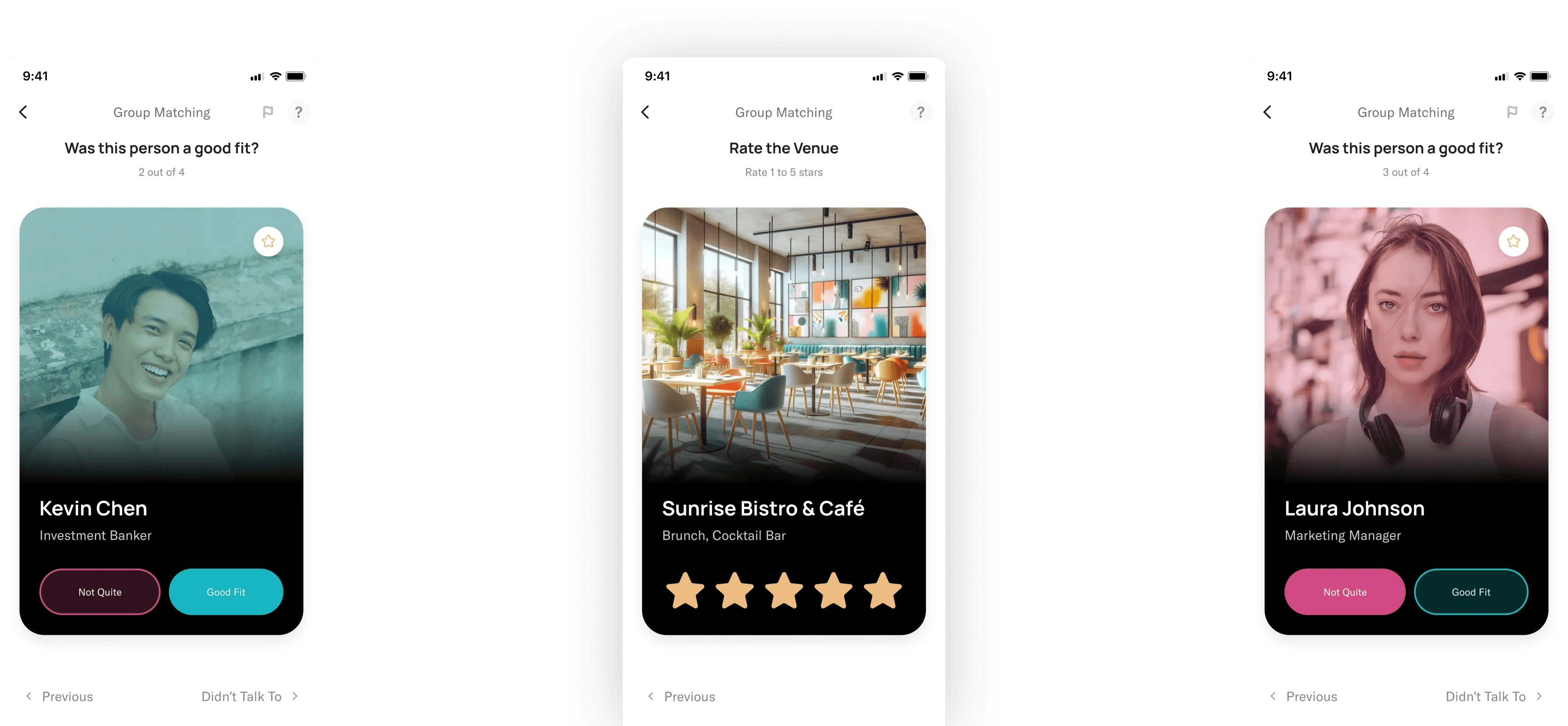
I refined my designs using Better Off's design system and ensured they aligned with the rest of the app. These prototypes went through multiple iterations, eventually culminating with a design that was intuitive, simple, and coherent with the overall product.
High-fidelity prototype, and mockups – used to receive feedback needed for implementation.
Adding two new features
At this stage, the CEO came to me with two new features he wanted to add – Rate the Venue & Rate the Event. Gathering feedback had become easier than ever with this feature so we added that star rating system used in other areas of the app.
At this point in the design process, our goal was to add these 2 new features while maintaining consistency with the existing design. The main change we made was replacing the swiping gestures with a simple tap.
These were the final prototypes were approved for implementation.
High-fidelity prototype, and mockups – used to receive feedback needed for implementation.
PROTOTYPES
Refine the design and receive feedback critical for implementation
I refined my designs using Better Off's design system and ensured they aligned with the rest of the app. These prototypes went through multiple iterations, eventually culminating with a design that was intuitive, simple, and coherent with the overall product.
High-fidelity prototype, and mockups – used to receive feedback needed for implementation.
Adding two new features
At this stage, the CEO came to me with two new features he wanted to add – Rate the Venue & Rate the Event. Gathering feedback had become easier than ever with this feature so we added that star rating system used in other areas of the app.
At this point in the design process, our goal was to add these 2 new features while maintaining consistency with the existing design. The main change we made was replacing the swiping gestures with a simple tap.
These were the final prototypes were approved for implementation.
High-fidelity prototype, and mockups – used to receive feedback needed for implementation.
PROTOTYPES
Refine the design and receive feedback critical for implementation
I refined my designs using Better Off's design system and ensured they aligned with the rest of the app. These prototypes went through multiple iterations, eventually culminating with a design that was intuitive, simple, and coherent with the overall product.
High-fidelity prototype, and mockups – used to receive feedback needed for implementation.
Adding two new features
At this stage, the CEO came to me with two new features he wanted to add – Rate the Venue & Rate the Event. Gathering feedback had become easier than ever with this feature so we added that star rating system used in other areas of the app.
At this point in the design process, our goal was to add these 2 new features while maintaining consistency with the existing design. The main change we made was replacing the swiping gestures with a simple tap.
These were the final prototypes were approved for implementation.
High-fidelity prototype, and mockups – used to receive feedback needed for implementation.
PROTOTYPES
Refine the design and receive feedback critical for implementation
I refined my designs using Better Off's design system and ensured they aligned with the rest of the app. These prototypes went through multiple iterations, eventually culminating with a design that was intuitive, simple, and coherent with the overall product.
High-fidelity prototype, and mockups – used to receive feedback needed for implementation.
Adding two new features
At this stage, the CEO came to me with two new features he wanted to add – Rate the Venue & Rate the Event. Gathering feedback had become easier than ever with this feature so we added that star rating system used in other areas of the app.
At this point in the design process, our goal was to add these 2 new features while maintaining consistency with the existing design. The main change we made was replacing the swiping gestures with a simple tap.
These were the final prototypes were approved for implementation.
High-fidelity prototype, and mockups – used to receive feedback needed for implementation.
CONTENT STRATEGY
Using strategic copywriting to guide our users
We also discussed the importance of content strategy and design. There were 4 areas where we felt users may have some confusion, so we used strategic copywriting to try and avoid those:
When to skip users?
People may just skip users they didn't have a good fit with, however, we wanted to discourage this since that doesn't help the algorithm. We changed the word "skip" to "Didn't talk to" to make it more clear when someone should press that button, and discourage spamming it.
The purpose of the survey
Helping users learn why they are doing this is important to getting accurate results. To ensure this we included a splash screen at the beginning where we explain why we're doing this.
This is NOT a dating app
We knew that this design might feel like a dating app, so to prevent this we shifted the focus from the person to the social interaction. We used the terms "Good Fit", "Amazing Fit", and "Not Quite" to do this.
Flagging users is serious
To make sure that people knew flagging a user was serious we added 2 confirmation stages and required a description of their actions. This will prevent accidental or improper flagging.
CONTENT STRATEGY
Using strategic copywriting to guide our users
We also discussed the importance of content strategy and design. There were 4 areas where we felt users may have some confusion, so we used strategic copywriting to try and avoid those:
When to skip users?
People may just skip users they didn't have a good fit with, however, we wanted to discourage this since that doesn't help the algorithm. We changed the word "skip" to "Didn't talk to" to make it more clear when someone should press that button, and discourage spamming it.
The purpose of the survey
Helping users learn why they are doing this is important to getting accurate results. To ensure this we included a splash screen at the beginning where we explain why we're doing this.
This is NOT a dating app
We knew that this design might feel like a dating app, so to prevent this we shifted the focus from the person to the social interaction. We used the terms "Good Fit", "Amazing Fit", and "Not Quite" to do this.
Flagging users is serious
To make sure that people knew flagging a user was serious we added 2 confirmation stages and required a description of their actions. This will prevent accidental or improper flagging.
CONTENT STRATEGY
Using strategic copywriting to guide our users
We also discussed the importance of content strategy and design. There were 4 areas where we felt users may have some confusion, so we used strategic copywriting to try and avoid those:
When to skip users?
People may just skip users they didn't have a good fit with, however, we wanted to discourage this since that doesn't help the algorithm. We changed the word "skip" to "Didn't talk to" to make it more clear when someone should press that button, and discourage spamming it.
The purpose of the survey
Helping users learn why they are doing this is important to getting accurate results. To ensure this we included a splash screen at the beginning where we explain why we're doing this.
This is NOT a dating app
We knew that this design might feel like a dating app, so to prevent this we shifted the focus from the person to the social interaction. We used the terms "Good Fit", "Amazing Fit", and "Not Quite" to do this.
Flagging users is serious
To make sure that people knew flagging a user was serious we added 2 confirmation stages and required a description of their actions. This will prevent accidental or improper flagging.
CONTENT STRATEGY
Using strategic copywriting to guide our users
We also discussed the importance of content strategy and design. There were 4 areas where we felt users may have some confusion, so we used strategic copywriting to try and avoid those:
When to skip users?
People may just skip users they didn't have a good fit with, however, we wanted to discourage this since that doesn't help the algorithm. We changed the word "skip" to "Didn't talk to" to make it more clear when someone should press that button, and discourage spamming it.
The purpose of the survey
Helping users learn why they are doing this is important to getting accurate results. To ensure this we included a splash screen at the beginning where we explain why we're doing this.
This is NOT a dating app
We knew that this design might feel like a dating app, so to prevent this we shifted the focus from the person to the social interaction. We used the terms "Good Fit", "Amazing Fit", and "Not Quite" to do this.
Flagging users is serious
To make sure that people knew flagging a user was serious we added 2 confirmation stages and required a description of their actions. This will prevent accidental or improper flagging.
NEXT STEPS
Implement and test this design
This feature is currently in the development stage, once implemented we will be able to test it with real users and see if it leads to an increased survey completion rate.
NEXT STEPS
Implement and test this design
This feature is currently in the development stage, once implemented we will be able to test it with real users and see if it leads to an increased survey completion rate.
NEXT STEPS
Implement and test this design
This feature is currently in the development stage, once implemented we will be able to test it with real users and see if it leads to an increased survey completion rate.
NEXT STEPS
Implement and test this design
This feature is currently in the development stage, once implemented we will be able to test it with real users and see if it leads to an increased survey completion rate.